News
News >
Behind the cover: Designing Act of Grace
We spoke to Sandy Cull, cover designer for Act of Grace by Anna Krien, about the design process.
How did you first get into designing book covers?
After years spent designing magazines, and another decade or so in my dream job at Penguin Australia (where I worked on a series of amazing, super-lush, high-calibre ‘illustrated’ books: Mirka Mora’s Love and Clutter, Stephanie Alexander’s The Cook’s Companion, Carla Coulson’s Italian Joy), in 2006 I made the perilous decision to go freelance. I found myself being asked to work on genres less familiar – fiction and literary nonfiction – and I fell in love all over again with publishing. These presented a dramatic change of pace and a wholly different creative challenge – one I continue to wrestle with and revel in.
Can you tell us a bit about the process of designing the Act of Grace cover?
This debut fiction by a much-awarded author came to me not quite complete, but with mountains of expectation and excitement. Described as their lead fiction title, I could sense the thrill and anticipation in the editor’s emails. Such enthusiasm is contagious for any designer. Act of Grace is political, controversial and powerful. The brief was perfect – exceptionally well-considered, comprehensive and fulsome, flexible and non-prescriptive.
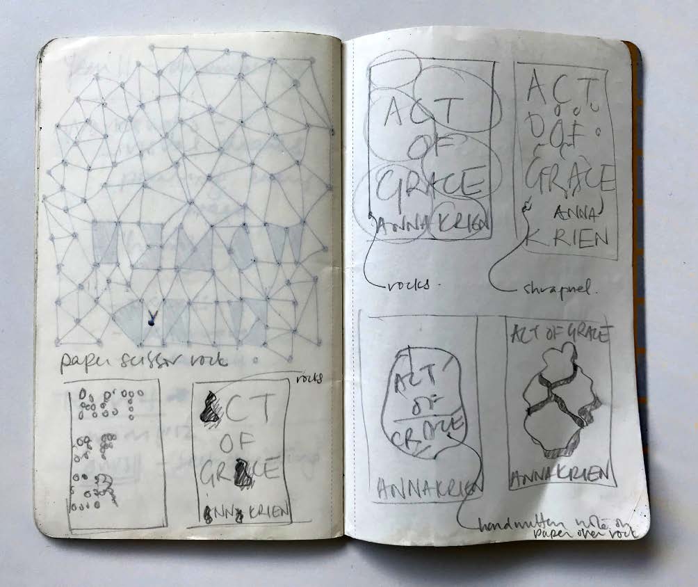
I read this manuscript on a coastal break. Once finished, I sketched out some ideas and thumbnails into a Moleskine. The first round of concepts is always when I’m most excited. For Act of Grace I took some photos, hand drew some type and did some 3D paper sculpting. None of this ended up being shown to the publisher, but they were totally consuming tasks and provided some key problem-solving time. It’s during this immersion that ideas might bubble to the surface and crystallise. I was also experimenting with rocks and images of shrapnel and broken glass.
There were multiple design roughs of this cover prepared – can you tell us a little about these and why you think the final version won?
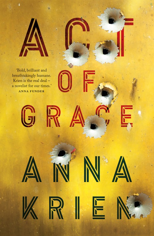
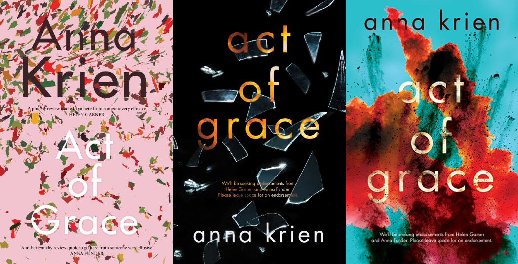
When the first concepts were described as ‘not being visceral enough’, I added more drama and tactility to these same themes. I also explored some landscapes to represent a sense of place and offered a few font alternatives. Around this time the publisher showed me an overseas cover that they felt was the preferred tone and flavour. It had a photo of a wall, pockmarked with bullet holes. In the third round I followed this lead but also included some bright, dazzling explosions. When these emerged on my screen, I decided they were right on target. The two final options – bullets or explosions – apparently enjoyed some lively debate in-house. I suspect that the bullets won out because it offered a more literal, what-you-see-is-what-you-get representation of the gritty and powerful narrative.
What do you think a cover should do for the book it represents?
The cover should honestly and refreshingly represent, interpret and visually translate the text inside, and in doing so, entice a browser and help to sell the book. It should be stimulating and distinctive, unlike any other cover already out there.
Has there been a cover or concept that's been particularly difficult for you to design?
Oh, how long have we got here? Countless covers fall into this category.
How much of the text do you usually read before you start designing?
I read fiction manuscripts from beginning to end, always. I read at least intro/summary/ several chapters of a nonfiction manuscript. Sometimes I re-read parts. As a cover designer, I thoroughly revel in reading a manuscript. Apart from being an incredible privilege, I see it as my responsibility. You have to do the work, know the topic, and that means getting up close with the text. Immersing yourself.
What's your favourite book cover trend at the moment?
Honestly, I try not to refer too closely to trends because I don’t want to be too influenced by them. A trend is ‘a current style or preference’ and, by definition, is applied over and over again. The designer’s job is actually to achieve the exact opposite – to create something distinctive and exciting, something that will lure a potential reader, something contextualised and individualised, just for this book.
So in answer to your question, the latest trend is to have type poking through foliage or creatures. It’s used everywhere. There’s a return to the visual cues of the seventies and eighties, which could be, I surmise, a nostalgic yearning for a period in our history and for some of us, in our memories, of fun and optimism.
Is there a trend you'd prefer to see fade away?
Type poking through foliage and creatures. I’ve done a few of these myself …
And any parting thoughts or comments?
At the risk of sounding banal or trite, it’s humbling to work in publishing, and with such great writers and editors. I am, as ever, in awe of their craft. As a bonus, I always feel that the projects I get to work on are quite prescient, or crucial, or an important tonic, and that the world is greatly enhanced by their existence. It was such a privilege to work on this title for this author, and to work with the team at Black Inc. I hope Act of Grace is received warmly and widely, and enjoys the success it absolutely deserves.
Find out more about Sandy and her work at sandycull.com.

Buy the book